Thursday, January 27, 2011

Hendry's Sunrise

6 sec @ 17mm and f/22, ISO 100

This was from a beautiful morning last October; I can't believe how long it's been since I took this!

I'm sitting on a pile of unprocessed images right now--the problem is it takes me a good 2 hours to process and share a photo like this, and I prefer to do it all in one sitting. It's a little rare lately that I have that kind of time, plus the energy to be able to commit to seeing it through.

On top of that, they all feel like "4 out of 5 stars", so I'm not dying to share them. It seems important, though, to finish what I started, and to get my work out there so I have something to show for it. And if nothing else, I want to be able to look back at what I've been shooting and watch my progress!

I shot this image at f/22 to slow the exposure, even though I knew my sensor was pretty dirty. The resulting dust spots were a nightmare--I did a rough count of my spot removals in Lightroom... There were 60!

Here's the original, unedited image.

Tuesday, January 18, 2011

Line

The line formed by the foam on the leading edge of the tide

Before I go into explaining what I'm doing with a post filled with nothing but boring pictures of lines... a little background. A relative gave me a book for Christmas titled Talent Is Overrated, by Geoff Colvin. It's been an exciting read--it argues that world-class performers, from Mozart to Tiger Woods, got that way not through an innate giftedness (it's tempting to attribute people's achievements to talent that we can never have), but through grueling practice and effective coaching. Colvin ascribes their greatness to a particular style of practicing that specifically targets your weaknesses (making the practice fundamentally draining and not fun), and that uses exercises that can be performed in high-volume. He presents a lot of compelling evidence from studies and from details of the lives of legendary athletes, musicians, chess players, and business people.

One of the biggest hurdles for me has always been the fear that without some inborn artistic ability I would never become a decent photographer. My experience has gradually taught me otherwise, though, and the arguments in this book have completely blown that thinking out of the water for me.

I'm excited, now, to apply these concepts to improving my photography. Over the years, I've gradually learned that becoming a great photographer is not so much about learning how to use all the features on a camera and all of the tools in Photoshop, but more about becoming an artist who can recognize the beauty in a scene and use those tools to bring it out.

I'm not going to photography school, or even photography class (at least while there's two toddlers at home), but I do have some good books and friends to help guide me. I'm going to have to be mostly self-taught in my spare time, but I'm encouraged by Colvin's anecdote of Benjamin Franklin, who practiced to become an accomplished writer while working full time at a printing press and relying on the works of other greater writers as a guide.

The edge of the cliffs against the sky is a common line in my photos.

For my first exercise, I'm exploring the concept of line. The exercise has evolved a bit as I've worked on it, but here it is in the form of an assignment:

Take at least 20 pictures of line, with 10 in man-made environments, and 10 in nature.
  • The emphasis is on form over content--the images don't have to be interesting, just demonstrate a concept.
  • In the man-made environment, the images have to be unique in terms of what type of contrast (light and shadow, different textures, etc.) creates the line. This is because man-made lines are abundant.
  • In nature, I didn't apply this restriction--the images can be of any naturally occurring line. This is because I mostly shoot in nature and I simply want to learn to recognize all of the lines I encounter in the places I typically shoot.

The line formed by the border between two materials or textures

The emphasis on form over content is helpful because it means I can shoot these images easily at any time, even on my lunch break when the light is harsh and terrible :).

Also, I quickly realized that there are many different uses for lines--horizontals, verticals, diagonals, and curves all have different qualities. Some lines lead the eye along them, others serve as a frame or a lens to focus your attention.

For this exercise, though, I focused on simply what defines a line. I want to be able to recognize all of the lines in a scene--both to recognize what lines are available to use in making my composition, and to recognize any lines that might be interfering with my shot. All too often I pull the images off the camera at home and spot distracting lines that I didn't see while I was shooting.

A series of objects can form a line, such as a row of rocks at the beach

With all that out of the way, here is the full gallery of my results!

The images also seemed to become an exercise in minimalism (if I'm using that label correctly), because I always tried to isolate the line as much as possible from any surrounding distractions.

Overall, I think the exercise was a success. I'm finding that when I look at a scene or an image now, I'm paying much closer attention to where there is contrast. Perhaps most significantly, I think practicing this as an exercise has also caused me to look more critically and deliberately at a scene--to be less distracted by the exciting natural beauty and to be more focused on what design elements are available in front of me.

The line formed between light and shadow can be very strong

Finally, it's been abundantly clear while doing this that "line" is far from everything, and there are many more forces at work in an image to learn about. I'm excited to move on to the next one!

Saturday, January 1, 2011

Leadbetter At Night


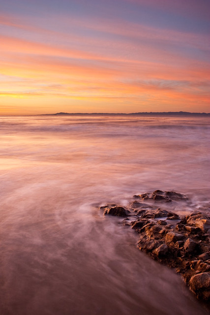
I love shooting seascapes, but it's tough right now to get out at sunset to capture those exciting colors. Luckily, shooting the beach at night seems to be just as satisfying, and a lot more manageable time-wise!

You just need a relatively low tide to expose some good rocks, and a mostly full moon to provide light, both of which I had on this night in December.

At f/5.6 and ISO 200, a 6 minute exposure seemed to be the sweet spot. I pride myself in my ability to enjoy solitude, but I have to admit the 6-minute exposures got to me. I used the count down timer on the iPhone to time it, so I'd get an alarm when six minutes was up, but I still found myself anxiously checking the timer every 30 seconds. Next time I'll have to bring a friend, or maybe a book and a reading light or something :).

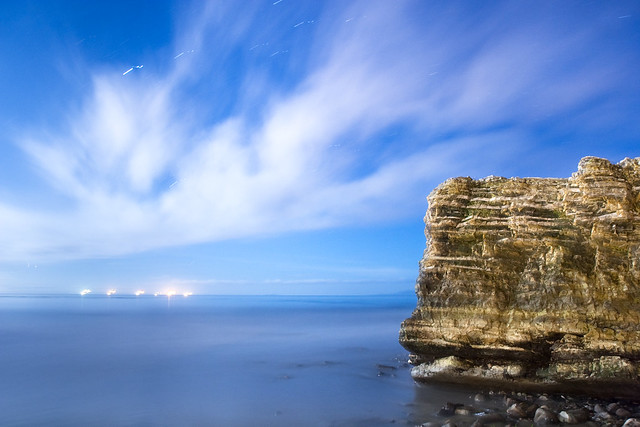
One lesson learned--with these long exposures, make sure there's plenty of room between you and the tide line. During this shot, I watched the tide slowly creep closer and closer to my tripod. There were two especially far-reaching waves that sent water up past one leg of the tripod. This caused the sand to settle and the leg to sink ever-so-slightly. The result is very noticeable in the stars and the oil rigs--you can even make out how it moved twice!

The tide was coming in quickly and threatening to trap me at the end of this point, so I didn't get a chance to retake. I like the image enough that I decided to just leave it for now, though, and do better next time :).

Editing Details

For this photo, I wanted to take the opportunity to share in depth the steps I took to edit it. I think there's a lot of value in sharing this stuff in detail:
  • It helps me solidify my understanding of the techniques I used.
  • It gives me an opportunity to reflect on the approaches I took, and maybe recognize some areas for improvement.
  • To my more experienced readers and friends, I hope you'll point out anything I might have done better.
  • Finally, I hope you learn something from it!
The original image:

Some initial work in Lightroom:

1. Rotate -.67 degrees, it was just a touch crooked. To get my landscapes level, I generally take a test shot (in this case with high ISO and wide aperture to make it quick), then zoom in and compare the horizon to the frame of my camera's LCD to check if it's level.

2. Color Temperature to 3100K. When shooting at night, I use the 'tungsten' white balance setting to get it close (this ensures the sky comes out nice and blue). I shoot in RAW, though, so I can always tweak the white balance later. Here, I wanted it just a little cooler.

3. Darken the left-hand-side with a gradient filter in Lightroom. The glare from the moon is visible here, so I wanted to counteract that to balance the image, and applied a graduated filter of -2/3 stops. From playing with the image in both Lightroom and Photoshop, it seems that Lightroom has an advantage here because it's working with the original RAW file.


I made a similar adjustment to the top right corner of the image to lighten it a bit.


Now into Photoshop

I screwed around in Photoshop a lot, but here's what I landed on.

1. Apply a curve to the sky to control the contrast there. I added a curve adjustment layer to the image, and after a lot of tweaking, decided on the following curve.


I think my reasoning for this curve goes something like the following. This is where I'd love any input on my thought process.
- I know I want to add contrast, so I know I'm going for some kind of S-shaped curve.
- The highlights in the clouds are far from maxed out, so I push those up hard.
- I use the pointer tool in the top left of the dialog to select a dark part of the sky, then click, hold, and drag down to darken the sky. There's not a lot of deliberate thought guiding how far I go with this--I'm just going off my instincts for what looks good. I don't really trust my instincts yet, but I'm stuck with them for now!

I use a feathered brush to paint a vector mask for this curve adjustment layer so that it's only applied to the sky, and not the cliff. I also masked out the oil rigs to protect the highlights there. For the oil rigs, I reduced the brush's "flow" to about 20 to apply a lighter mask there.

Tip: You can hold option and click on a vector mask to see it as in the above screenshot.

Roll over the below image to see the before and after of just applying this curve.

2. Apply a levels adjustment layer to the cliffs to add contrast there. I'm not entirely sure how I decided to do levels on the cliffs rather than another curve. It's likely that I just tried it, liked the result, and kept it.


You can see that I just brought the white point in to push the lighter parts of the cliffs up, then moved the grey point to darken the cliffs back down a little.

I wanted these levels to apply to just the cliffs, so I used an inverted version of the mask from the curve layer for the sky.

Tip: You can hold option + shift, then click on the vector mask from one layer and drag it to another layer. This copies the mask and inverts it in one step (holding 'option' makes a copy of the mask rather than moving it, and holding 'shift' inverts the mask).

3. Finally, a few basic adjustments.
- Added a brightness and contrast layer. I boosted the contrast some because I was still looking for more contrast in the cliff and in the clouds against the sky. Also, I nudged the brightness up a bit just to lighten the image.
- Added a hue and saturation layer. I actually desatured the image some, because I felt like the curve had made the sky's blue overly rich.

And that's it!