Thursday, February 26, 2009

Santa Barbara Harbor


I've had some fun this morning!

My favorite type of photography has always been scenic and landscape photography--these are the photos that most inspire me to get out and shoot. There's an element of adventure to it that I really enjoy; getting outside in the early hours of the morning, waiting patiently for the light to be just right. It's something I've experienced only a few times, but the idea of it excites me.

Last night, I resolved to wake up early and go shoot something. I was excited, but I was also actually pretty nervous. I was sacrificing a good night's sleep for this--what if I got out there and didn't take a single worthwhile picture? If I go out there before sunrise, am I going to be able to see anything? What kinds of 'interesting' characters am I going to run into?
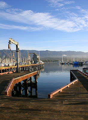


The sun rose at 6:30am, so I woke up at 6. That's probably not too early to a lot of you, but I typically go to bed between 11-12pm, and I need my eight hours to function. I had laid out my clothes and gear the night before, hoping to throw them on and head out. I ran into a few hiccups, though; I decided I needed some quick breakfast, and on my way out I got something in my eye / contact (my eyes are really dry in the morning) that had to be dealt with.

One of my intentions for this outing was to learn about the time around sunrise. When does it start getting light? If there are clouds, when are they lit up? When's the best light? I learned that at 6:00am, 30 minutes before sunrise, there's plenty of light outside for me to frame a shot with. I also learned as I headed out the door at 6:15 that the colors in the clouds happen just before sunrise... So I got to watch some gorgeous colors on my drive to the harbor, but they were about gone by the time I got there. That's ok, though, because not long after that, everything gets bathed in a beautiful warm light, and that's what I was really after this morning.

I'm calling this one "TIE Fighter" :)


Earlier this week I came across a great site full of good articles by a guy named Ken Rockwell. I particularly enjoyed his recent article on composition. This was my favorite part:
"In a nutshell, composition is all about balance. It's all about balance between light and dark, warm and cool, big and small, rhythm, pattern, line, curves, impact, negative space, texture and a lot more."

I've always understood composition as just the placement of objects and the lines and curves they form that lead your eye through the photo. But it's so much more than that! As he says, it's also about balancing the elements of the photo (I think another way to put that is that it's about contrast). What really excited me, too, was that I felt like I could recognize each of those elements of composition in his excellent photo at the top of the article. And hey, if I can recognize and appreciate them, I should be able to reproduce them!

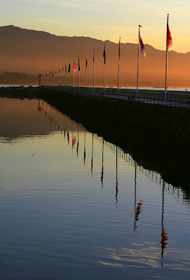
I focused hard on these new elements of composition when I went out this morning. I especially tried to frame photos with both warm and cool tones, and to look for compositions with rhythm and pattern. Another point of advice Ken offered was not to let any lines "break the frame" (lead your eye out of it), and I think that helped me a lot.

This was my favorite of all of the shots.


Despite my efforts, I still ended up with a mixed bag of compositions ("mixed" being a generous term, as it implies half-and-half. Try one-in-ten). And some that I thought were really clever when I was shooting turned out to be garbage. I am proud to say, though, that there were a number of times where I framed a photo, thought hard about the composition, realized it was mediocre, and didn't press the button. That takes a lot of restraint! I bet one advantage to film photography is just that each shot is going to cost you x cents to process and print, so it better be worth it.

Ken also notes that a good way to test your composition is by looking at the thumbnail. If the thumbnail isn't interesting, then your composition's bad. I tried hard, but I failed to find a good composition for this whale tail bench.
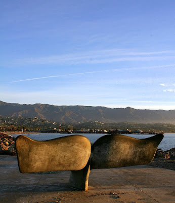


There's actually a small sculpture right in front of it that's hard to keep out of the shot. I took a photo anyway, and the full-size image is pretty interesting because it's an interesting subject with good light. As a thumbnail, though, it becomes less enticing, and the problems with it become apparent.

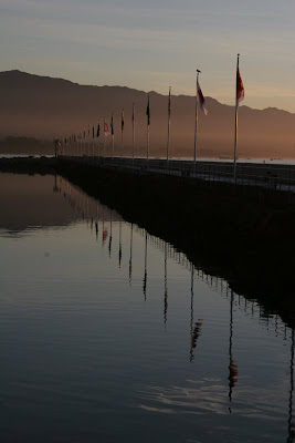
The last thing I'll say about my outing was that when I got back, I was really disappointed with the images. The colors were very muddy, and the photos were not very sharp. With some editing, though, I was really pleased with the results. They were most in need of an increase in saturation.

I edited them in Picasa, and did the same handful of things, to varying degrees, that I did with the army jeep:
1. Crop
2. Auto-contrast
3. Saturation
4. Sharpen

Here's the before-and-after of the flags.


Sunday, February 22, 2009

Saturday Morning

This past week all of my "photography time" went to preparing that post on histograms and messing with a timelapse sunset video that I've been rather unsuccessful with. So by Friday night, I was really eager to just go out and shoot!

Saturday morning presented lots of fun photography opportunities.

We live in the downtown area of Santa Barbara, which means an itty-bitty house and a pretty busy street outside, but it's a lot of fun to be able to walk downtown or out somewhere to eat. One of our favorite places to hit up on the weekends is The Daily Grind, a coffee shop that serves some good food and superb pastries. Our favorite is the raspberry streusel.


I noticed this Porsche Cayman pull in to the parking lot, and it had kind of a strange license plate, "LKYCAR2".


Then Jess pointed out the license plate frame...


Pretty crazy!

The Daily Grind attracts a lot of very beautiful, earthy people (Santa Barbara's full of them)--people loaded with character that would be fun to photograph--but I'm not nearly bold enough to point my lens at a stranger. Any thoughts from people who take these kind of pictures?

The real photography highlight for me was this old army jeep that's usually parked around our block on the weekends. Most weekends its parked on a less interesting part of the street, usually under a tree with little light and between some other cars. I've been meaning to photograph it anyway, though, but today I had a special opportunity--it was parked across the street from our house, all on its own.

Whenever I spot something interesting to photograph, there's a strong urge to just put the camera to my face and snap a photo, without much thought for composition or anything. I call these photos "tourist shots" because they're the kind of photos most tourists take while documenting the places they're visiting. I ended up with a couple tourist shots of the jeep before I came to my senses :).

The sky was a boring grey and the jeep was parked in front of a big green bush, so there wasn't anything to provide a good contrasting background for just a "shot of the car", so I mostly photographed its details. Here are a couple of the whole jeep, though, so that you at least know what I'm photographing.


This jeep is covered in interesting details, so I took it as an opportunity to practice some composition. I tried pretty hard here to think through each shot and compose them carefully. It's tough, though; I think I get impatient and fire away even if I'm not totally sold on what I've framed.


After that, we did yard work for a couple hours. One of my favorite things in life is chopping wood. You take big round logs and split them into beautiful little wedges ready to be tossed on the fire. It also reminds me of the scene in the book / film Shane, where Shane and the boy's dad heroically hack away at the old stump that's blighting their farm. And it's just fun to swing a sledge hammer!

There was a tree that had to be cut down in our front yard, and I've gradually been splitting the logs.


I've kept you here a while, now, so I'll just say a few things about the photograhps.

They were all taken with our new Canon 50mm f/1.8 lens, which we're loving. I think it's very true that working with a fixed-length lens can do a lot to inspire creativity. It also produces noticably sharper images, and allows for a very shallow depth of the field which was key for some of these shots. Not to mention, at $90, it's cheaper than either of our zoom lenses!

I was a little "lazy" with the processing of these photos... I just used Picasa for all of them. Picasa is an awesome editor; it has some very powerful features presented very simply, and it's got a surprisingly complete set of tools. It also has a small enough set of tools that you can safely experiment with them without feeling overwhelmed. There have been a lot of times where I've spent a half hour messing with a picture in PhotoShop trying different things, and never feeling that great about any of them.

I pretty much applied the same set of effects to all of the photos.
1. Crop
2. Auto contrast
3. Increase saturation
4. Sharpen


I also adjusted the white balance on some of the photos--it was a cloudy day, giving everything a bit of a blue cast--so I adjusted the color temperature to warm it up a bit. It bothered my brain to see the photos looking warmer than I remember the subject being, but I think the photos look better for it.

Friday, February 20, 2009

Histograms and the Levels tool, Part I

There have got to be a million tutorials out there on histograms and the levels tool, and I don't have any conceit of writing a better one (Check out the links at the bottom for some really stellar articles). But, half the reason I write this blog is because I learn things well by reading and taking notes, so this blog is really kind of a way for me to "take notes" on what I'm learning.

Before we talk about the levels tool, we have to talk about histograms. A photo's histogram shows the number of pixels at a given brightness. It represents the distribution of pixels in the photo from light to dark.


If the histogram is bunched towards the left the image is going to look dark. If the histogram is really slammed up against the left side, a lot of pixels in your photo are showing up as 100% black and you've lost detail in the image. This means the exposure is too dark for the camera sensor to distinguish details in the shadows.

Our dog Maeby was kind of enough to pose for some example photos. This photo I under-exposed by two stops.

In the same way, if the histogram is pushed to the right side, the image is going to be very bright. And if it's smashed against the right side, you've lost detail in your highlights (photographers would say that you've "blown" or "clipped" the highlights).

This next photo I over-exposed by two stops.
On automatic exposure, your camera's light meter will try to expose the photo such that there's a nice even distribution in the histogram.

This last photo was exposed according to the light meter.

You can view a photo's histogram in your image editing program, or it's actually available on the LCD display of your camera as well. On Canon cameras, if you press the info button a couple times it will cycle to a view that shows you both the image and the histogram.

This is a really great tool to have built into your camera! It let's you get a quick idea of what the exposure was like--whether it was improperly exposed, or whether your scene exceeds the dynamic range of your camera (take a shot from inside your house through a window and you'll run into this problem--too dark inside, too light outside).

The concept of the camera sensor losing detail in shadows and highlights refers to the camera's limited "dynamic range", the range that it can distinguish between dark and light areas in a frame. Dynamic range is another photography term you'll hear thrown around a lot, especially with regards to "High Dynamic Range" (HDR) photography, a fun subject for another post.

The Levels and Curves tools allow you to manipulate your photo's histogram in your image editor. In particular, the Levels tool allows you to stretch your histogram to increase contrast and extend the dynamic range of the photo. I'll cover the levels tool in part 2; I think that's enough for now!

Further Reading -- i.e., better articles ;)
Luminous Landscape
Cambridge In Colour

Thursday, February 12, 2009

Bath Time

People complain that the internet is full of too many pretty pictures of babies, flowers, and sunsets.

Well, I'm going to choose to be part of the problem here and not part of the solution.


My wife Jess and I just became parents last November when she gave birth to our son Logan. Logan has a pretty wild story--after looking at the ultrasound the doctor told us we were having a girl. My wife kept up a nice pregnancy blog about preparing for little "Kate". We didn't find out that he was a boy until the doctor caught him and handed him over to us. What a shock!

The story gets juicier, but I'll let Jess' blog tell you the rest. She started a new one once we had our little man; here's the first post of the new blog detailing the drama.

Back to the photography...

One of our favorite things now is getting the whole family into the bath together. Logan loves it, we love it, the lighting's beautiful, and it's just dying for some photographs.


Baby pictures are fun because you get to just blast away. I took about 60 photos, about 10 of which were garbage, and another 40 were good memories but not worth sharing. Out of the rest I tried to pick a few that were blog-worthy.

A few things I learned:

One, where the baby's looking is all-important. The problem with a lot of the photos was just that he was looking down and to the right (like he always seems to be doing). The photos looked best when he was looking at the camera or at Jess; I imagine they would have looked cute if he was looking upward, too, but he never seems to do that :).

Two, I need to learn to use the auto-focus better. Things were moving too quickly for me to focus manually (and I often seem to do a poor job of focusing manually anyway!), and I had trouble getting it to focus on what I wanted. One of my favorite shots from the batch (below) turned out to be out of focus :(. I had some success with centering the image on something, holding the button down to focus, and then framing the shot. Just being more deliberate with that technique may be the key. Anyway, I think this calls for another post all about focusing!


On to the photo editing. The photos responded well to some work.


First, the colors came out a lot stronger with a good increase in saturation. The saturation alone seemed to really brighten up the image.

After that, everyone looked really pink! This was the first time I've made use of the "Hue" slider; moving the hue to the right made his eyes brighter and his skin greener, balancing out some of that pink.

I also increased the contrast a little, but it didn't need much.

Finally, before posting the image to her blog, Jess did some of her own work on the photo in Picasa. Picasa has some impressive tools that seem to work magic. She removed the little blemish on his cheek in Picasa using the retouch tool, and added some fill light to further brighten the image.

The other photos took the same adjustments to different degrees. I never touched the levels or curves directly for these--the sliders seemed to produce the best results.

Saturday, February 7, 2009

Monstro

Let's hope you don't have a sensitive stomach, because this one's going to get a little creepy-crawly.

When Jess and I moved to Santa Barbara two years ago from the Bay Area, one of the biggest surprises was the size of the spiders here. They're thick little fellas!

This little beast showed up in our front yard last September.


I usually knock down their webs, but this guy was so big, and his web was so huge, that I decided to leave him there out of curiosity. And to take some photos of course.


I was pretty disappointed with the original images I got. The problem was he spent most of his time sitting still in a little ball, with his legs tucked in. In order to get him to extend those creepy legs, I had to shake up his web by tugging on one of the long threads anchoring his web to the ground, the house, and the nearby tree (there was at least five feet between his web and every thing around him. How do they do that?)

That got him moving and being a more interesting subject, but then I had a different problem. Now he was moving and his web was swaying, and the camera's auto-focus had a tough time keeping up. As a result, none of the images turned out quite as sharp as I would have liked. Also, I hadn't yet learned the lessons that I did from my post on close-up photography, so I was also pretty confused about how to best fill the frame with him with the lenses at hand.

I think I was able to salvage a couple of the better photos with some pretty simple Photoshop work, though.

Here's the original of the first image.


The original looks very flat and almost hazy, and it's painfully noticeable that the spider's out of focus.

I used curves to bump the contrast by giving it a bit of an 'S' curve, and that helped a lot. I lost detail on the spider's body, but I think that brings more attention to his legs, which are more in-focus, and his general silhouette.

I also played with the white balance using a color picker tool. I clicked on the spider's body and got the green cast to the photo which I really liked. I can't claim to know what I was doing there--I was playing around and got an interesting (but not over-the-top) effect. That almost never happens; messing around usually just leads to some interesting, but ultimately silly and unmeaningful effects. I think what I'm learning, though, is that playing with the white balance can be a good way to change the color and tone of your photos while keeping them realistic.

The second photo was a simpler transformation. Applying an 'S' in curves made the colors pop and the web show up with more contrast against the background. Here's the original.


In my past two posts now, I've mentioned the Photoshop tools "levels" and "curves" and haven't said a single thing about what they are, as if I expect that you should know all about them already. Nothing could be further from the truth, though; I'm still learning how to use them myself. I promise I'll come back in a later post to cover what I'm learning about these tools.

If you aren't familiar with them, though, finding some tutorials on them is a great place to start in learning how to improve your photos in Photoshop or any other advanced image editing program. The "contrast" and "brightness" sliders in simpler photo editors are really just levels and curves adjustments.

Thursday, February 5, 2009

Night Palms

A few nights ago there were some high, whispy clouds in the sky. There are these palm trees across the street from our house that I love and I'm always trying to get some interesting shots with them. The thin clouds seemed like the perfect opportunity.


Night time photographs have always inspired me. Early on I discovered the work of a local photographer in Santa Barbara who takes the most breath-taking long exposures at night.

I've been dying to reproduce one of these ever since. It doesn't have to be a great shot or even a good composition, just seeing those colors come out of a night time photo would be amazing!

Here's how my little photo shoot went. I took about 40 pictures over the course of an hour or so. The exposures were in the neighborhood of 10 seconds, so each one took a while. I used our 50mm f/1.8 lens; the large aperture really helped bring the exposure time down!

They were also all done on a tripod, so if I wanted a different angle I had to readjust the tripod mount.

Here's a photo of me on the end of the driveway to give you a visual. Pretty ridiculous photo of me if I may say so myself, but we have to make some sacrifices here to share the experience :).


I look a little geared-up here--I've got a tripod and I'm holding a remote switch for the camera. Don't be intimidated, though; the tripod was a gift and was probably no more than $20. It's flimsy and not too easy to adjust, but it's light and gets the job done. The remote switch (RS-80N3) was more of a splurge, it's about $50 on Amazon. You don't actually need it here, though...

A remote switch serves two purposes for long exposures:
1. Pressing the shutter release on the camera body will move the camera slightly.
2. To get longer than a 30 second exposure, you need to switch to "bulb" and hold down the shutter release for the length of the exposure.

To solve number 1 you can just switch your camera to timer mode, so it takes the picture a few seconds after you touch the camera body. For number 2, my exposures were only about 10 seconds, so the "bulb" exposure wasn't really necesary.

So back to the story. I was having a lot of fun and was really excited--the photos were looking so good on the back of the camera! When I came back inside, though, I found out I had been making a fatal flaw... Almost all of the photos were out of focus!

It was really dark out and I could hardly see the palm trees through the view finder, so no wonder! I got the focus close, but not close enough. Here's an example.


I did a little processing of both of these photos in the GIMP. The histograms were very bunched up towards the dark end; I guess the originals were probably underexposed. I moved the slider in to brighten them up. For the first photo, I also used Colors -> Auto -> White Balance. This made the blue a little richer.

As always, let me know if you have any thoughts or questions!